
Brand Development & Management
Eight years of creating and scaling brand identities that promote essential social services to underserved populations.
Featured Projects
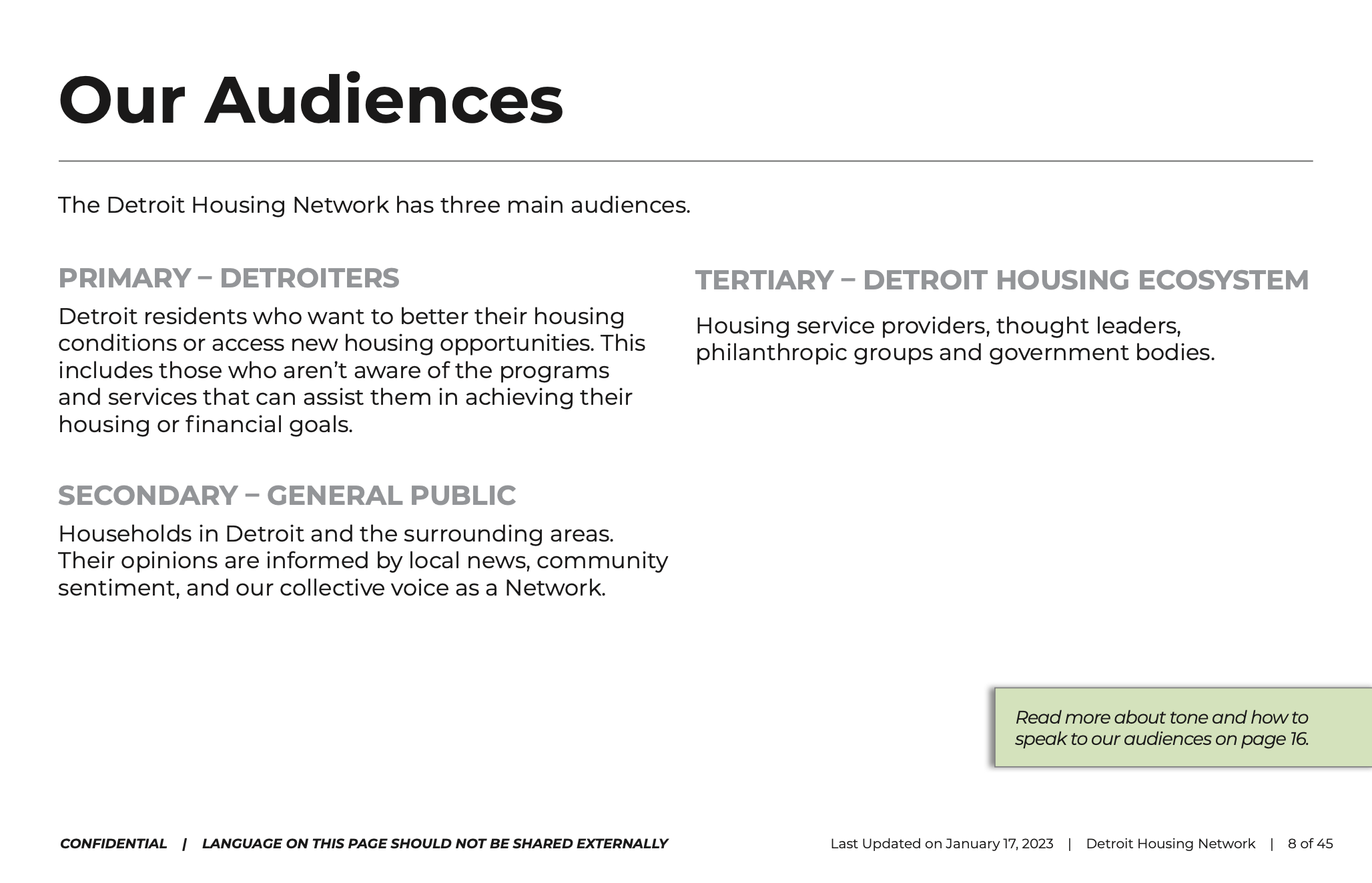
CHN Housing Partners, Detroit Housing Network, City of Detroit & Rocket Community Fund
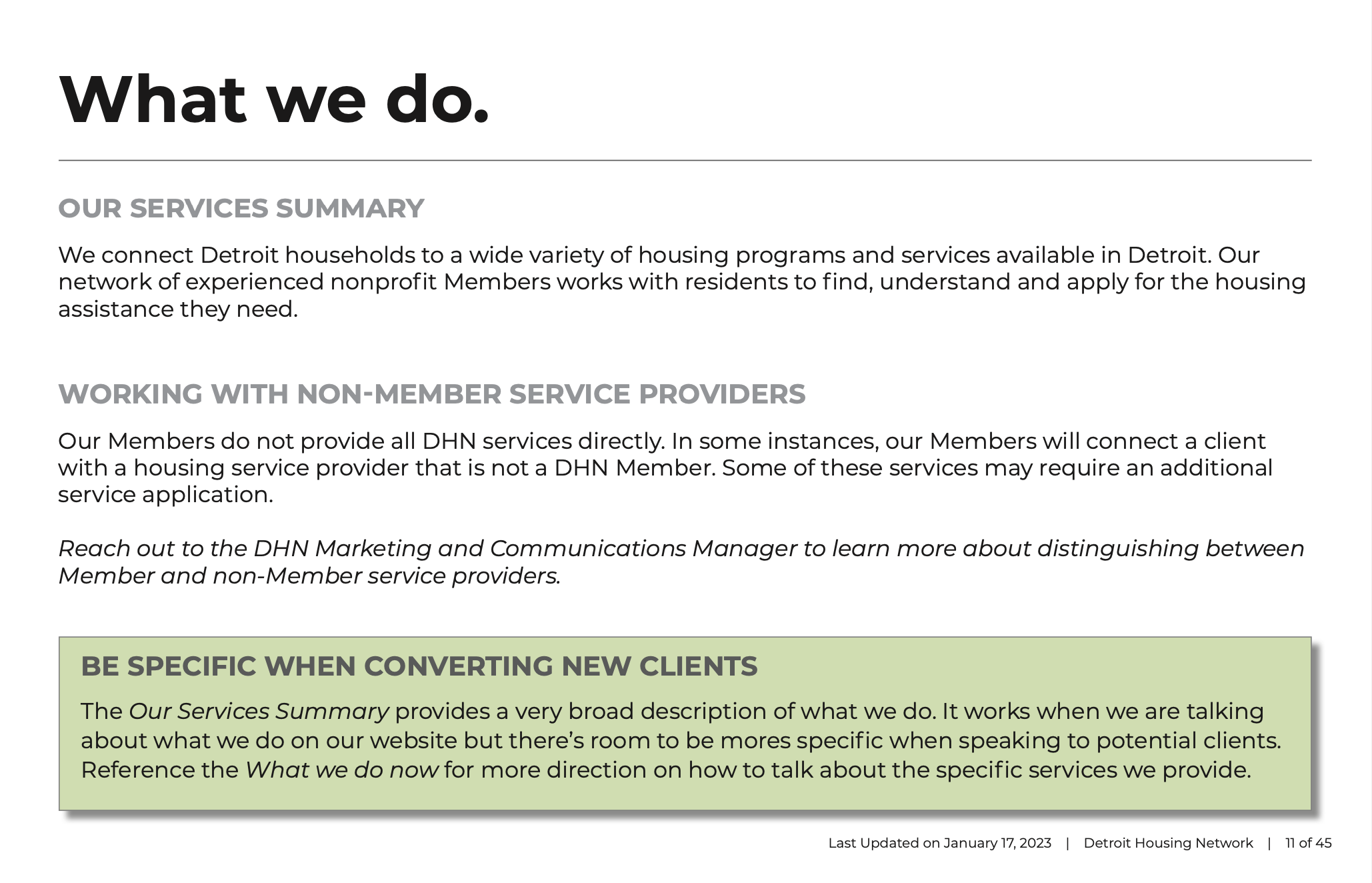
Simplifying the Way Detroiters Access Housing Services
-
Brand Management
Creative Direction
Copywriting
Graphic Design
Human Centered Design
Relationship Building
Stakeholder Feedback Facilitation
-
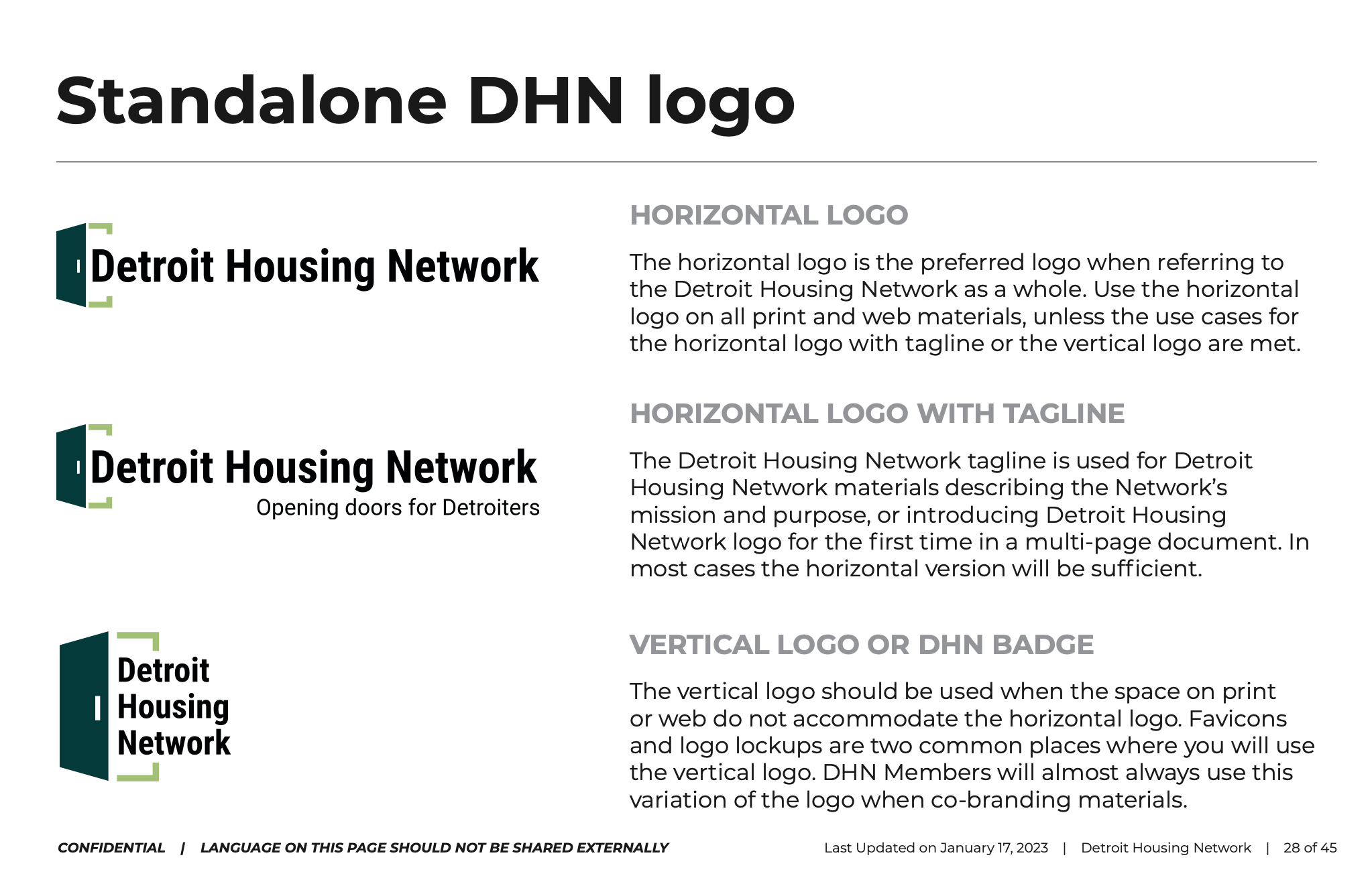
Brand Name
Logo
Launch Website
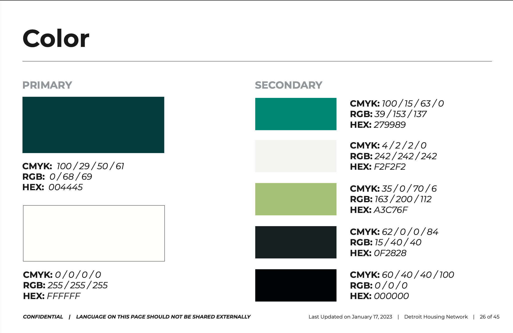
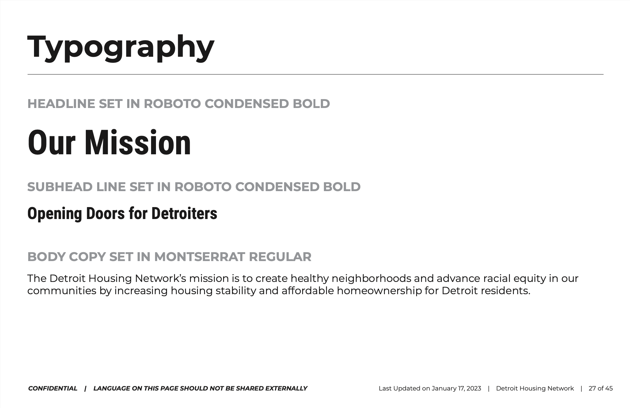
Brand Style Guide
Motion Package
-
Rocket Mortgage
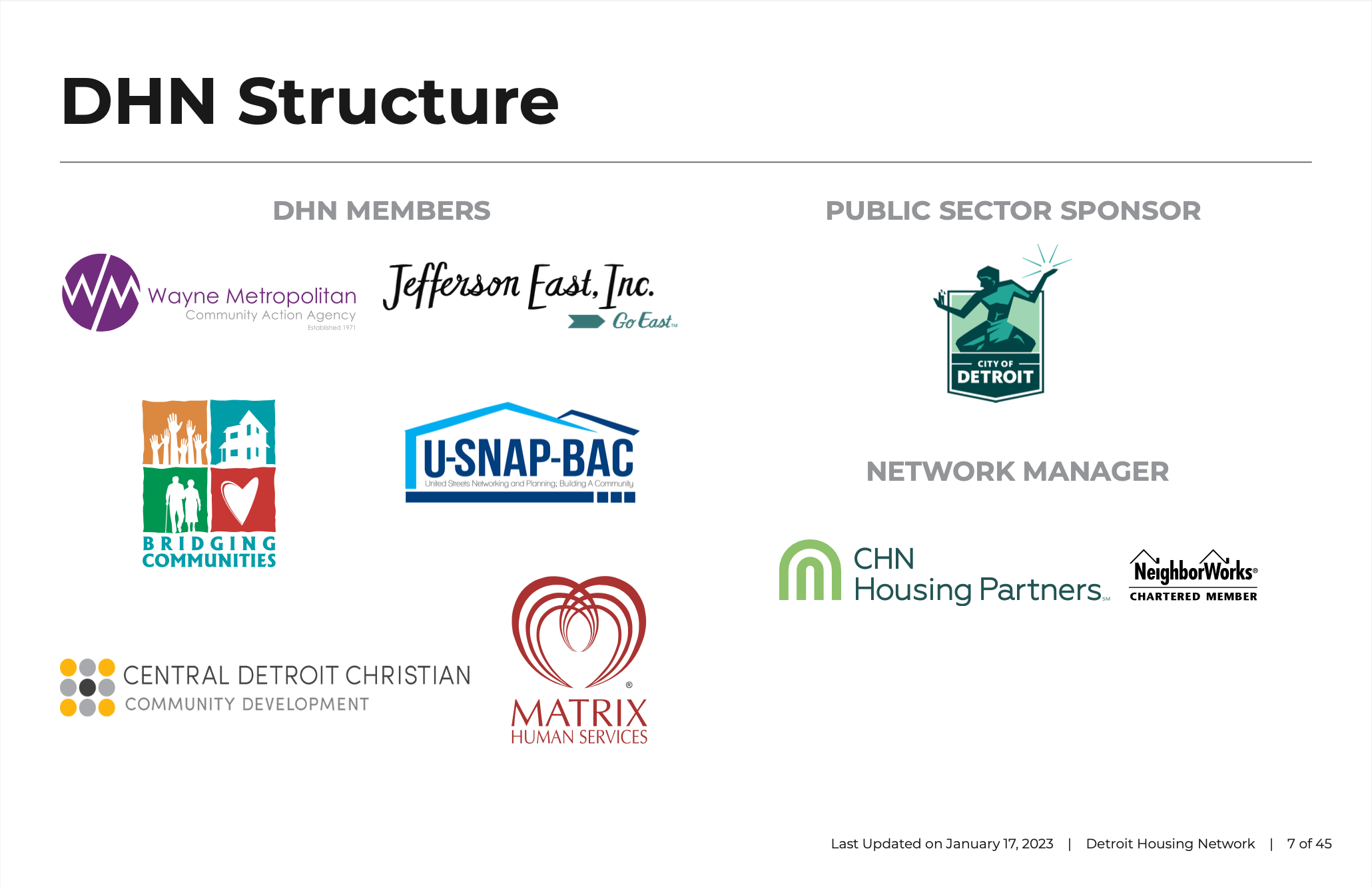
City of Detroit’s Housing and Revitalization Department
Bridging Communities
Central Detroit Christian
Jefferson East, Inc.
Matrix Human Services
MiSide Wealth (formerly Southwest Solutions)
Wayne Metro CAA
Yankee Peddler
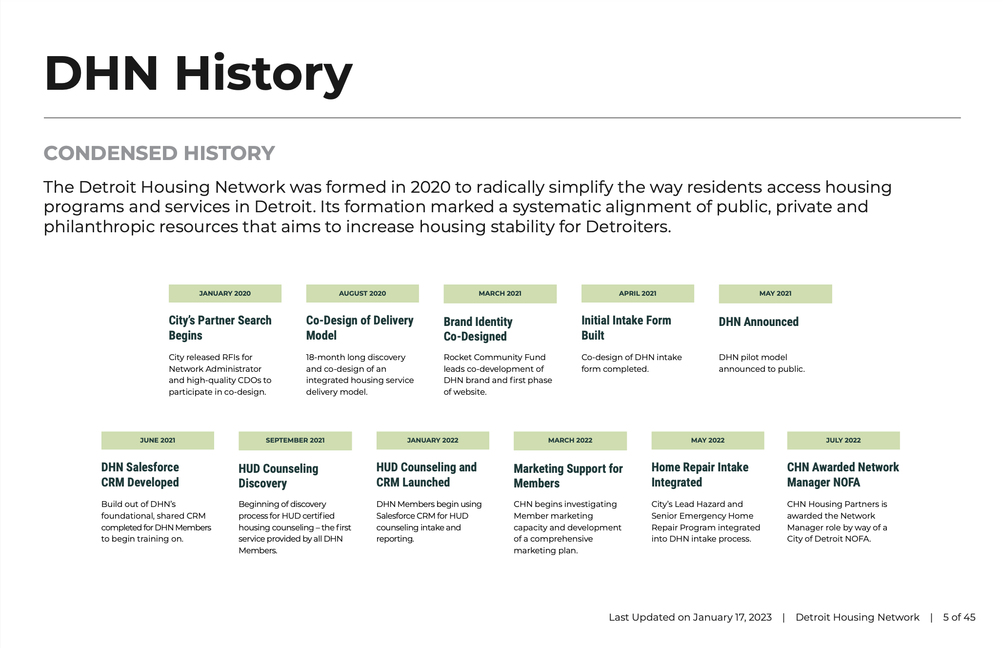
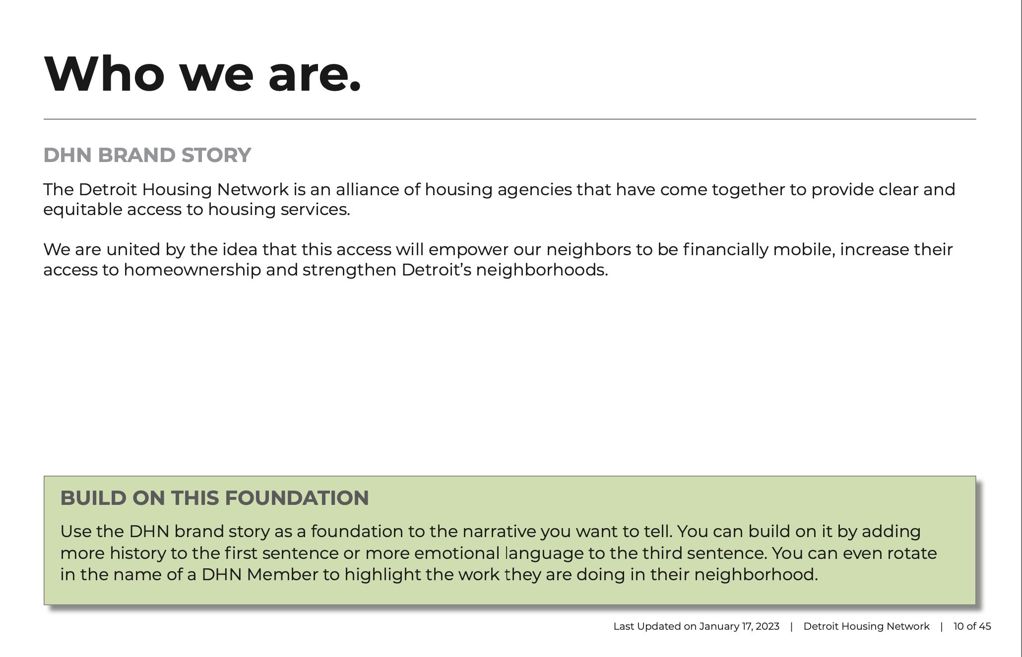
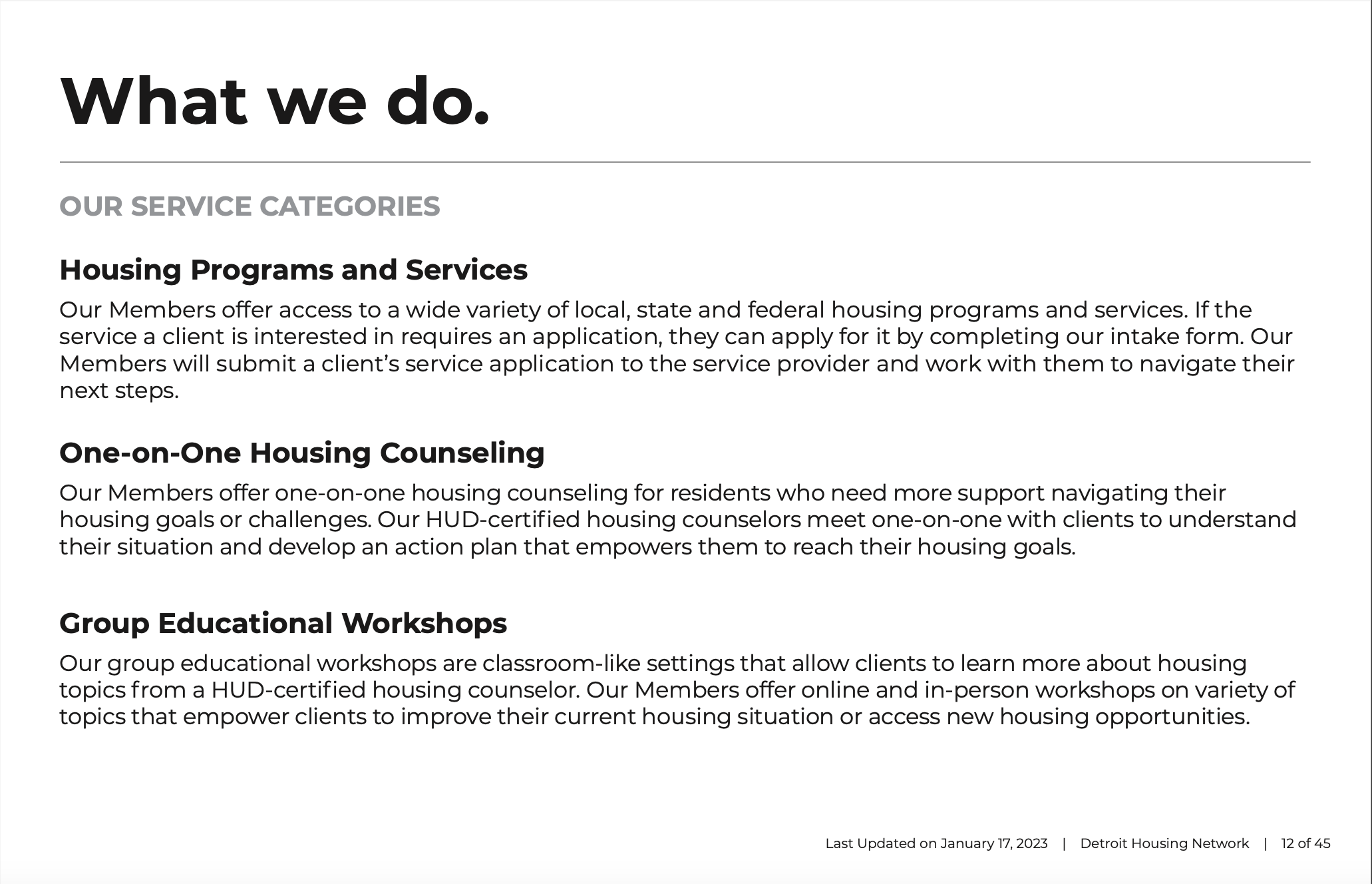
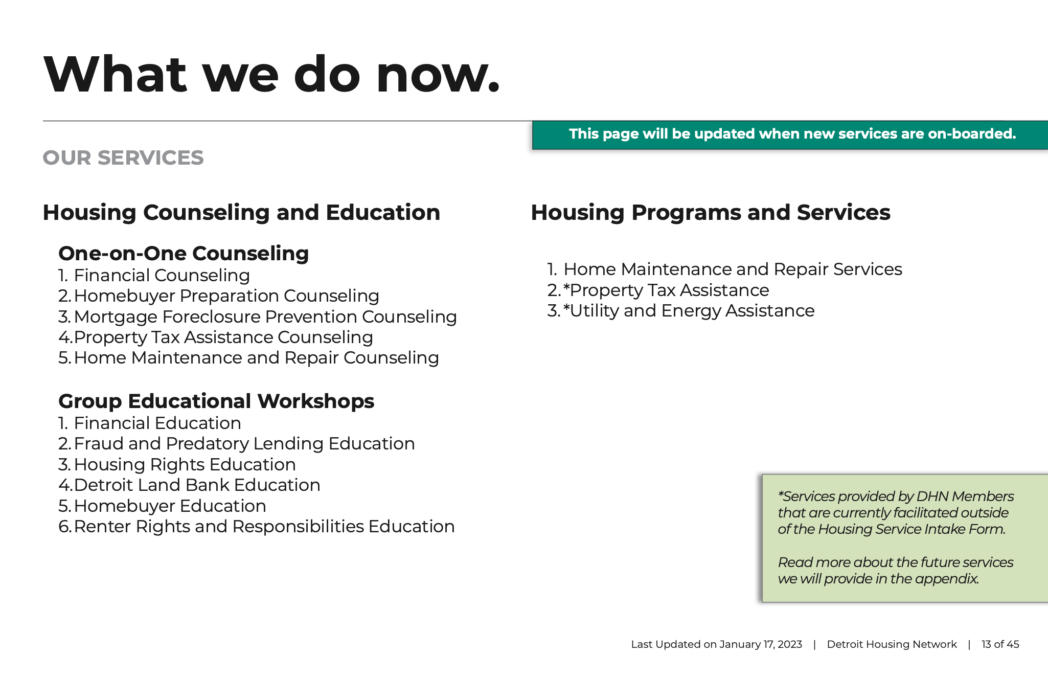
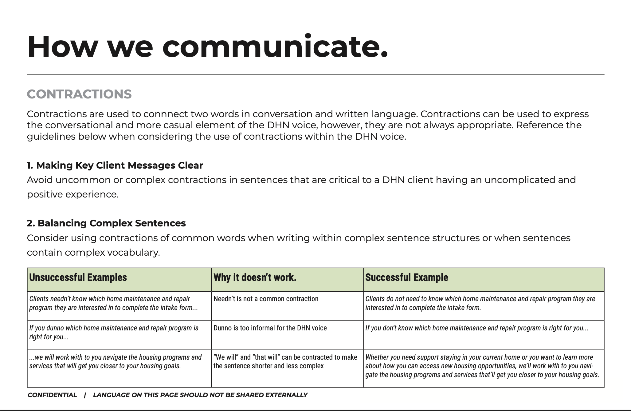
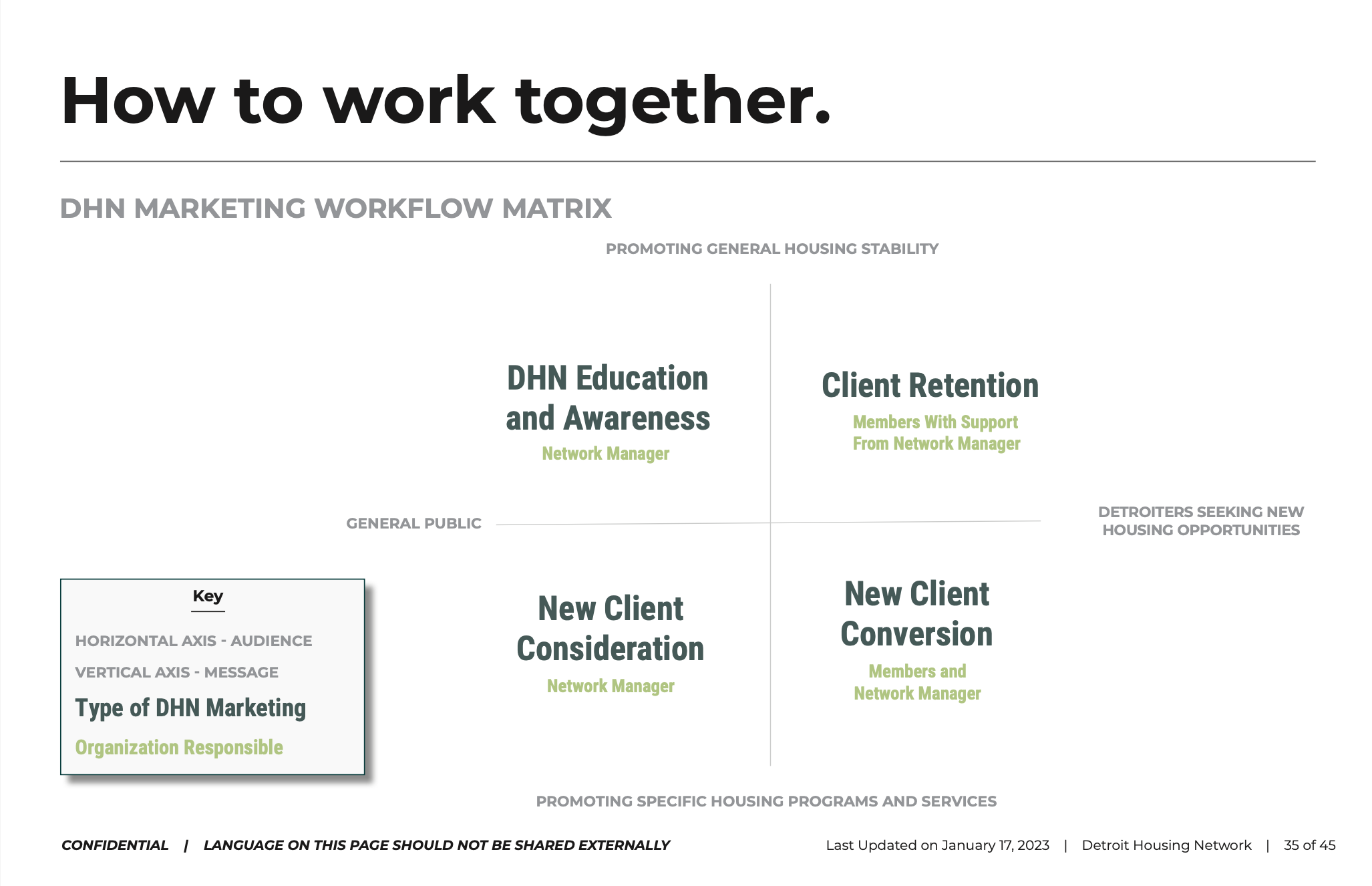
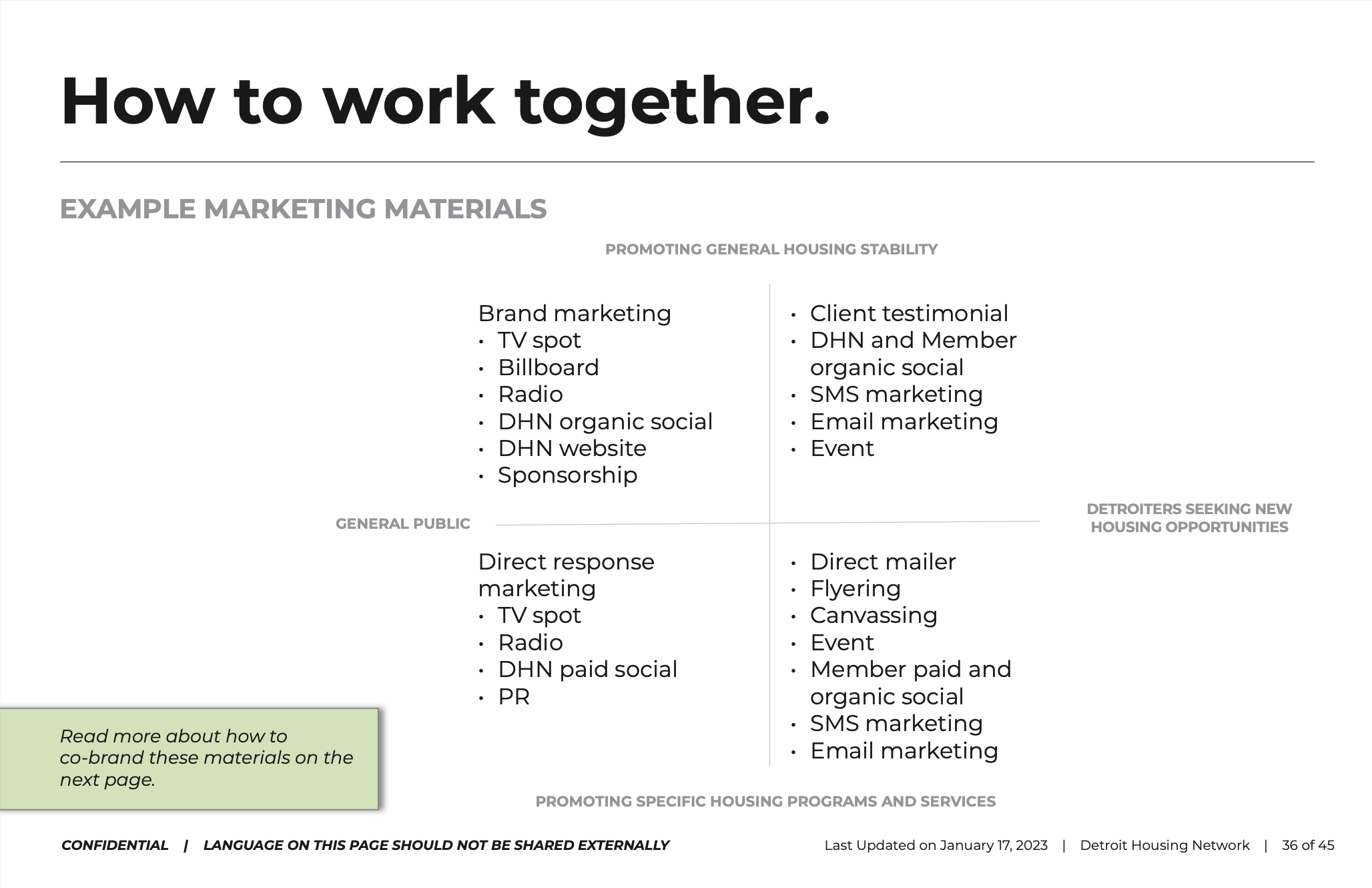
In 2020, the Detroit Housing Network (DHN) was created to simplify the way Detroiters access housing services. DHN would act as a single front door for Detroit residents to access myriad of housing programs and wrap around services provided by a network of DHN Members, Partners and Collaborators.
During my time at the Rocket Community Fund, I led the naming process, logo development and initial website build for DHN. This co-creation process involved stakeholders at all levels who provided feedback at key points in the brand development.
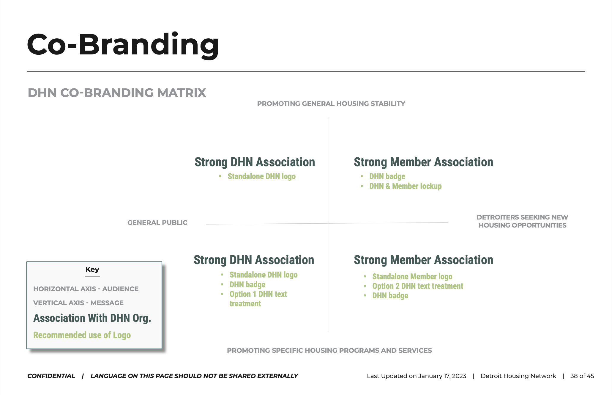
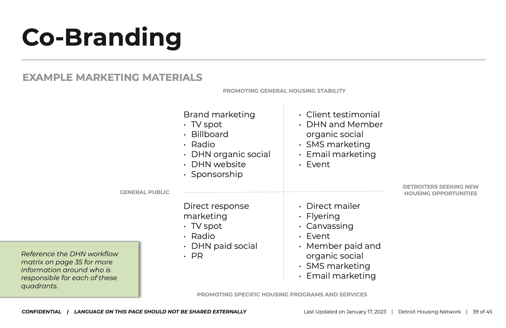
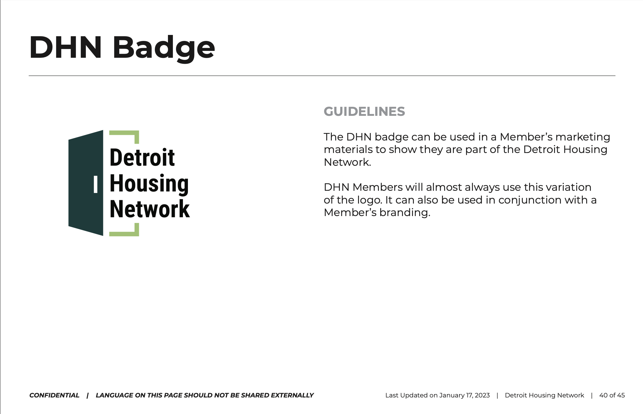
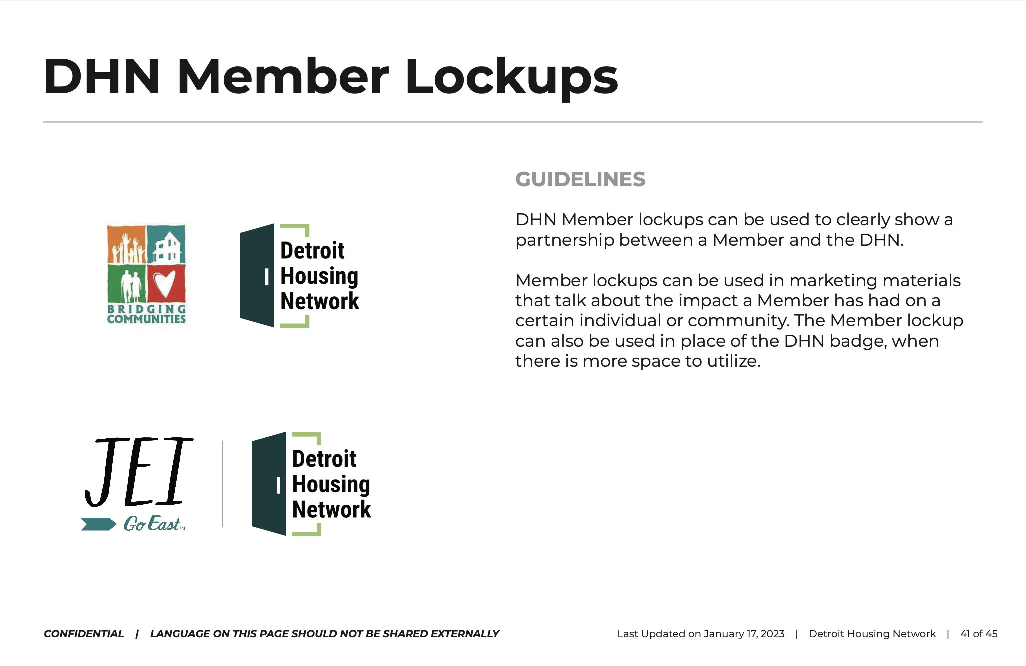
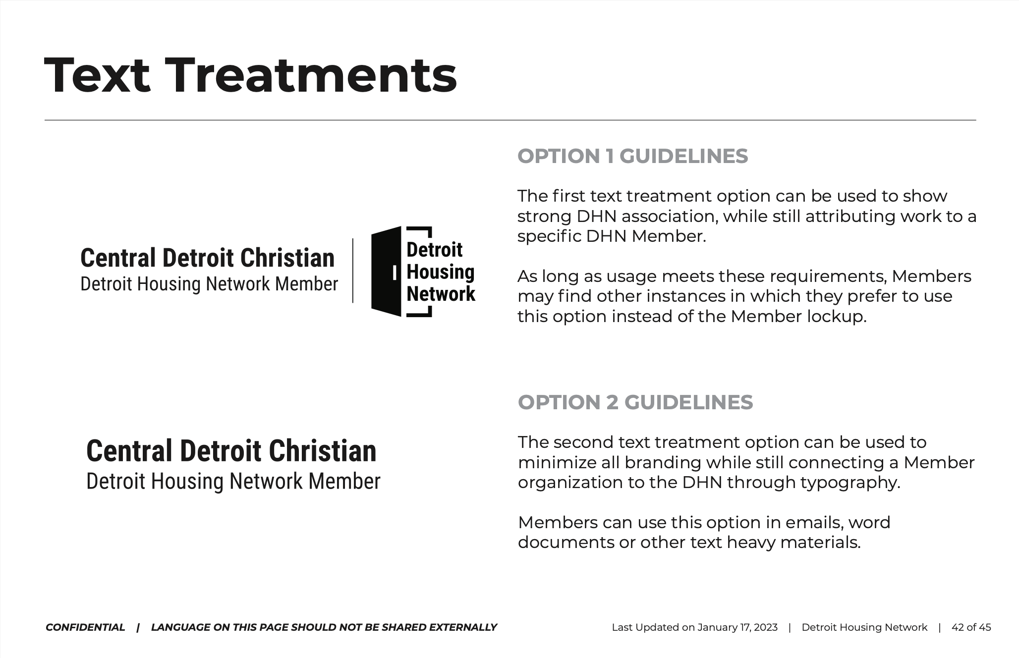
When I moved over to CHN Housing Partners to nurture the DHN brand even further, my first order of business was to develop a comprehensive Brand Style Guide for DHN. This guide - if distributed and adopted correctly - had the potential to reduce confusion and increase adoption of this essential brand that the City of Detroit was positioning as the front door to all City housing programs.

“The City and its partners offer a lot of great services to help Detroiters with their housing needs, but they don’t mean much if people don’t know how to access them. Thanks to the efforts of our partners and the generous support of the Gilbert Family Foundation, we now have a simple process to guide residents to the right housing resource and a growing number of programs to help them.”
I found that co-developing the initial DHN name and logo helped me to build a foundation of trust and communication with my new DHN stakeholders. This made tough conversations about “stepping-on-toes” or confusion about the new brand much easier to navigate.
Developing the DHN brand style guide was a key element in delineating how the DHN brand is distinct from our seven DHN Member brands. Not only did it help answer basic questions about which logo to use or how to describe DHN, but it helped to legitimize the DHN brand and get our stakeholders excited about it.
Four years after the development of these brand elements and DHN has collectively served nearly 15,000 households with over 20,000 different housing services.
Rocket Community Fund, Rocket Mortgage & The Rock Family of Companies
Creating a Culture Around Volunteerism for 20,000 Team Members
-
Brand Management
Creative Direction
Executive Leadership Navigation
Garment Production
Project Management
-
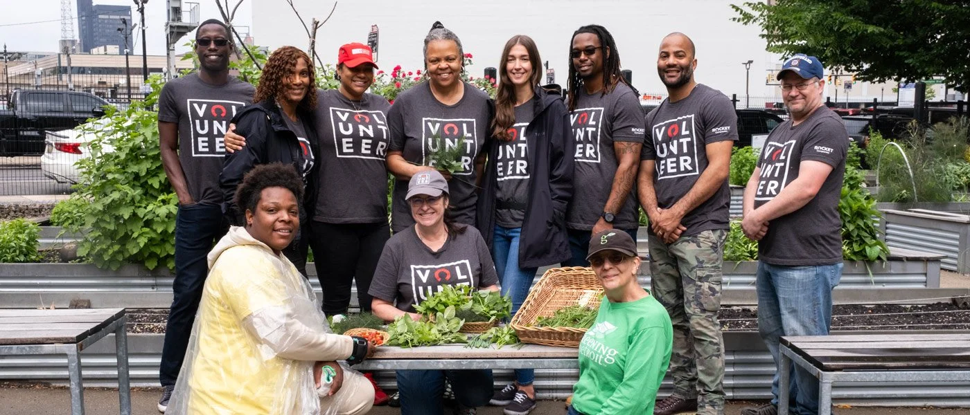
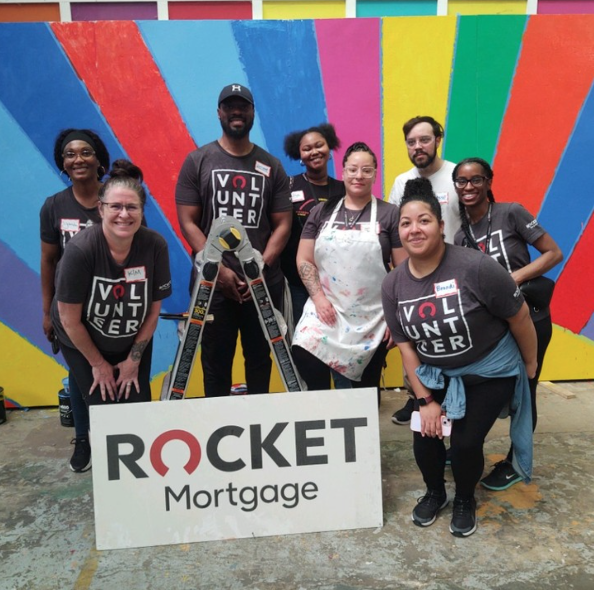
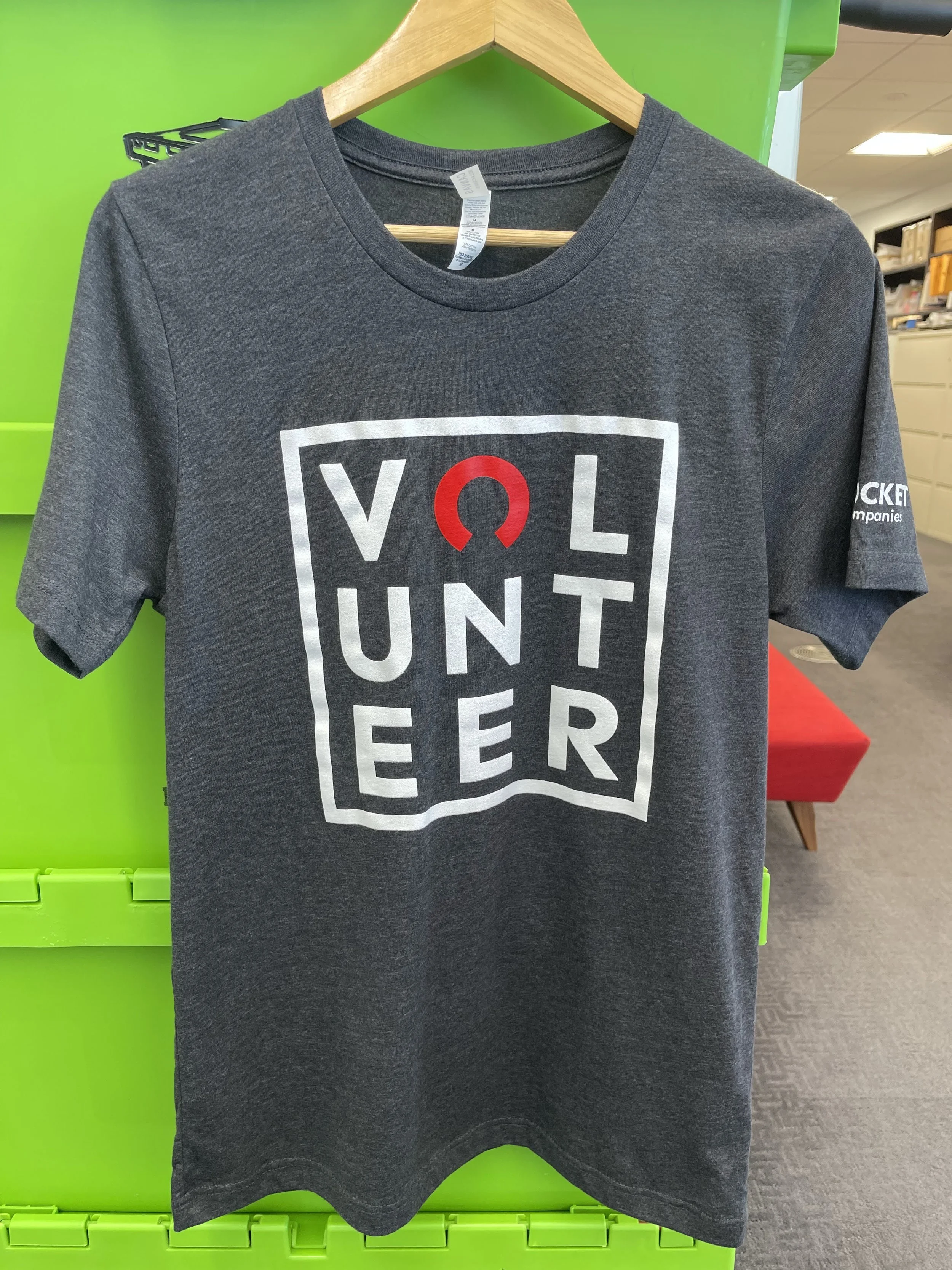
Company-wide Volunteer T-shirt Design
-
Rocket Mortgage Creative Team
Bedrock Creative Team
Other Creatives in the Rock Family of Companies
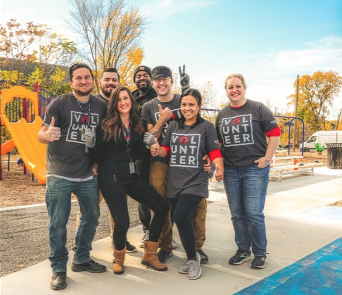
When I worked for the Rocket Community Fund, Rocket Mortgage and The Rock Family of Companies, we had more than 20,000 employees across Michigan, Ohio, North Carolina and Arizona. Volunteerism and Rocket’s “For More Than Profit” philosophy were key parts of company culture, internal messaging and recruitment strategies.
So when Rocket Mortgage went public and simultaneously dropped the Quicken Loans name, the outdated “Quicken Loans in the Community” volunteer brand needed to be updated. As the Creative Team that served the Rocket Community Fund, we saw an opportunity to utilize the new-and-improved brand system that Rocket Mortgage offered us.
We just had to get our designs approved by our leadership, the Rocket Mortgage CMO, Rocket Mortgage CEO, a Rock Family of Companies Chairman and the Founder and Owner of Rocket Mortgage…
“Simplicity is genius.”
As the Campaign Manager driving this project forward, I solicited the support of three other designers from across the Rocket Family of Companies (FOC), which was common practice when designing something for the larger FOC.
With the new Rocket rebrand on our heels, simplicity was in and complex color schemes and logo marks were out. This sentiment was our north star. Each designer developed two to three concepts and as we moved our way up the approval chain, our approvers whittled down our options by choosing their favorites.
We eventually landed on a concept that was simple and direct - a 3x3 grid that spelled out “VOLUNTEER.” For the 95% of team members who worked for Rocket, the “O” in Rocket would be replaced by the Rocket logo mark. For other organizations throughout the FOC, their company was represented on the yoke of the shirt. This simple T-shirt design would be worn by 20,000+ Rocket Family of Companies volunteers for the next four years, before Rocket’s next rebrand.